A Visual Insight into American Craft Beers
Portfolio | Links: Launch Project
For best experience, please view on desktop.
Ah, the classic data visualization dashboard. The user selects a parameter and then all the modules update based on the input.
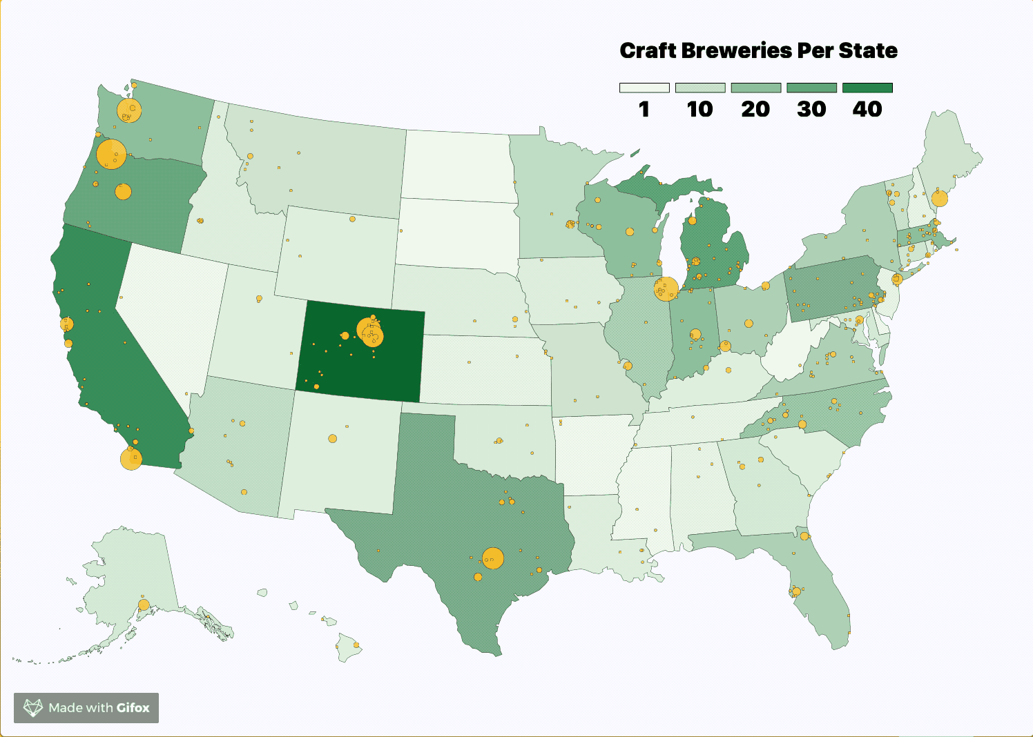
In this example, the parameter selected is a U.S. state. When the user clicks on a state, the dataset (consisting of breweries and beers) is filtered down to the state level. The charts track two important summary statistics of beer: alcohol by volume and IBU. The higher a beer is in IBU, the more bitter.
After the user selects a state, they can select another or click the existing state to go back to the country-level.
Beginning Challenges
At first, I wanted to implement a shopping cart experience where the user browses a selection of beers by type and then picks the ones they like. However, when I started making this project, I realized it was a lot more useful to summarize data from a top-down level. D3.js is very good at making charts that can link to each other and animate data when a condition is met. As soon as I embarked on this path, I realized the power of D3.js (and dare I say raw JavaScript?) at manipulating data in the browser.
The other major roadblock in the beginning was that all the APIs for beer on the internet are not public. As a lone student, I couldn’t secure any API keys, so I had to rely on CSV files I found online. I think the quality of the data from a API might be better than those of the CSV I found, but it didn’t change my workflow much, since nearly all of my work is in front-end data manipulation and display.
The Zoomable Map
I’m very proud I got the map to work. It uses a complicated D3 zooming feature that I really struggled with, but somehow got functional in the end. I also like that the map served as a handy controller to manipulate the rest of the data.
Each state is generated in SVG as a feature. When the user clicks on the feature, the map zooms in and passes filtered data to the charts.
Using CSS Grid with SVG
If you haven’t checked out CSS Grid yet, I highly recommend it. It’s the most powerful and easy way I’ve come across to lay out pages, and it’s totally native to CSS. However, implementing it in this project was quite tricky. I used FR units to style my dashboard, which renders the content depending on how much free space is available on the page. This worked out well, except that I was sizing my SVGs depending upon the size of the div they were nested in. These divs were defined in FR units. So I would get very oddly-sized SVGs, especially on portrait mobile displays, where window height is greater than window width. Also, in my Webpack setup, all the CSS was bundled into the JavaScript file. This really screwed things up! Somehow,the SVG wasn’t calculating the size of the divs correctly, so I was getting SVGs with no height. These problems coalesced into very odd layouts that only corrected themselves when the page was reloaded multiple times.
The solution involved using extract-text-webpack-plugin, which bundled my styles into a separate CSS file. I will probably do this from now on due to all the unforseen problems I encountered with my CSS in JS. I also set up some breakpoints in JavaScript, and rendered the height of the SVG based on a consistent ratio to the width. This gave me consistent width-height ratios across all screen sizes.
If you are using Webpack 4, use this plugin instead: mini-css-extract-plugin
Here’s how I did it:
//dimension of the window
const wW = window.innerWidth;

//This are the three SVG types in this project. The map, the histograms, and the scatterplot. These are the width and height variables for each:

//geomap dimensions
let mapWidth;
let mapHeight;

//histograms dimensions
let histWidth;
let histHeight;

//scatterplot dimenions
let scatterWidth;
let scatterHeight;

//Then, I set my breakpoints. First, I would get the width of the div that the SVG would be embedded in. This div was generated according to CSS Grid fr units. Then, I calculated the height by using a ratio, which kept things consistent on different screens.

//desktop
if (wW >= 768 ) {

  //1.4 ratio
  mapWidth = document.querySelector('.map').clientWidth; //700
  mapHeight = mapWidth / 1.4; //500

  //1.5 ratio
  histWidth = document.querySelector('.abv').clientWidth; //336
  histHeight = histWidth / 1.5; //222

  //1.3 ratio
  scatterWidth = document.querySelector('.scatterplot').clientWidth; //692
  scatterHeight = scatterWidth / 1.3; //535

//mobile
} else if (wW < 768) {
  //for mobile, I just set constant SVG dimensions. But dynamic rendering could also work.
  mapWidth = 250;
  mapHeight = 222;
  // mapWidth = document.querySelector('.map').clientWidth;
  //mapHeight = mapWidth / someRatio;

  histWidth = 250;
  histHeight = 222;

  scatterWidth = 250;
  scatterHeight = 222;

}
If you want to learn CSS Grid, I highly recommend these links:
CSS Tricks: A Complete Guide to Grid
A free Wes Bos course This was extremely helpful for learning Grid. He also has a free one on Flexbox.
I also use Firefox Developer Edition for the great CSS Grid debugging tools.