The Best MLB Players Ever
Portfolio | Links: Launch Project
Please view on desktop.
This was the first full-featured visualization I ever made with D3! I had several goals for this project:
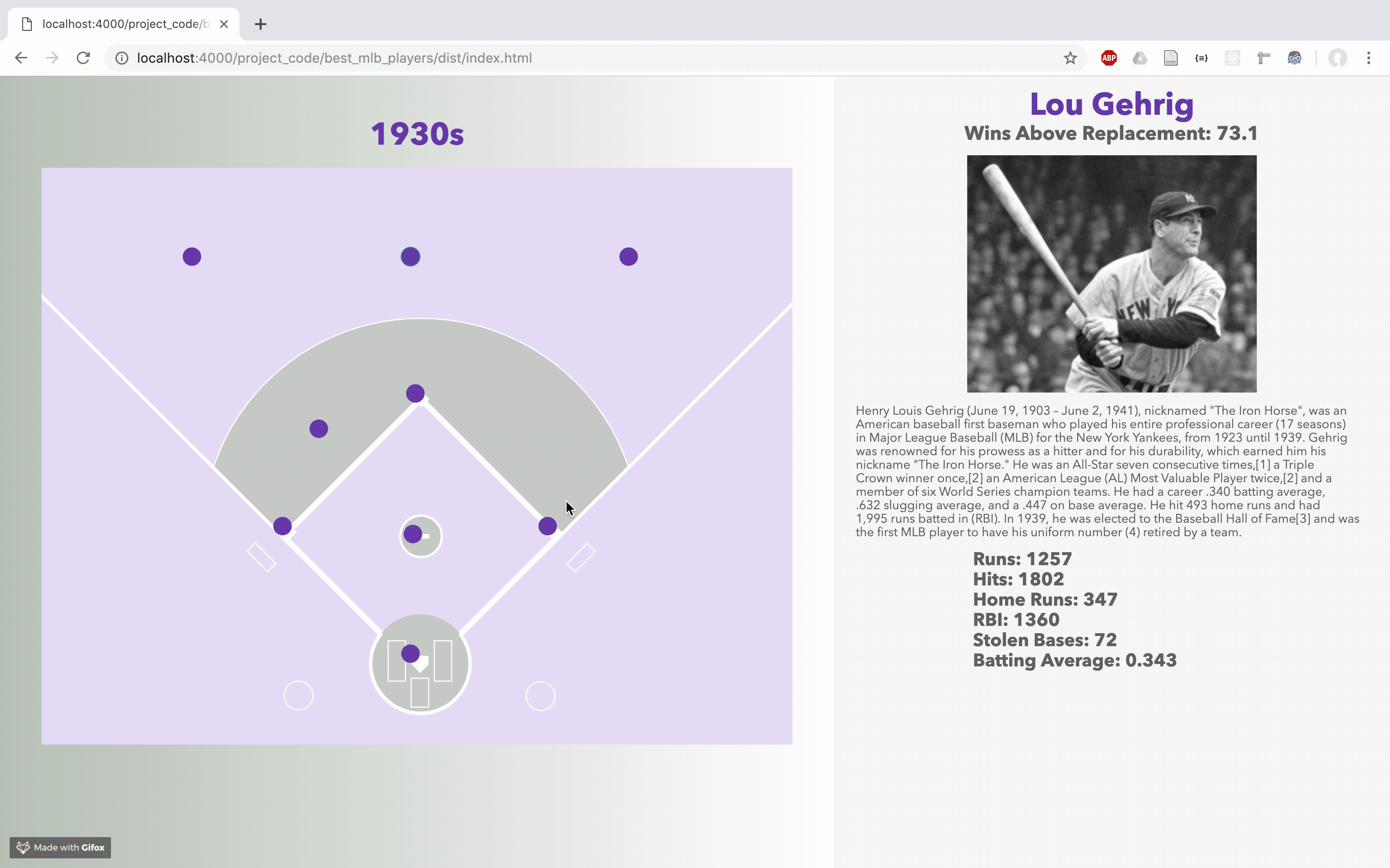
- Render an SVG baseball field to the screen, and position elements according to their position on the field. Data bind each element to a player.
- Modify the colors of the SVG depending on the decade.
- Implement a scrolling mechanism that changes the decade and data bindings.
- Display player bio, statistics, and picture in a tooltip-like display on the right.
I managed to include all these features. But did they work in the wild?
User Testing
I showed this work to a lot of different people. They included my uncle and dad, both baby-boomer baseball fans. They loved the nostalgia and snappy presentation of the players, but they didn’t quite understand how to scroll to move forward in time. Some of my younger subjects were able to conceptualize the scrolling better (not trying to suggest that age is inversely correlated with scrolling understanding!), but it was still a little tricky for them to navigate.
This is a weird scrolling project. It is powered by the Waypoints scroll library, but it doesn’t follow the traditional scrollytelling template. There isn’t a text sidebar that scrolls down the page, nor a CSS position:sticky mechanism that allows text to stay on the page and then disappear. In short, there’s no understandable mapping that directs the user to scroll to move forward in the graphic. This confused a lot of my users.
Ways to Improve This Project
First, I would probably ditch the scrolling dynamic. I really wanted to implement it because I wanted to get some experience with a scrolling library, but after my testing I don’t think it is appropriate for this project. I would probably put a set of buttons (or to save space, a drop-down) that allows the user to select a decade that updates the graphic. It is not as fun of a solution as scrolling to move forward in time, but I think it would be easier to understand.
Also, the design of this project could use some work. There isn’t any text hierarchy in the statistics section, and I want to rethink some of the colors, especially because some of the lighter ones make it hard to read the player names. Also, the introduction that appears when the page first loads looks quite odd, because it is being formatted from the CSS classes that style the player information. Since these classes are embedded in the HTML, I have to figure out how to change the style of just the introduction, while not affecting the player information. I haven’t exactly been able to figure out a solution to this, and I suppose that’s why UI libraries like React and Vue are so useful.
This project taught me a lot about D3, and also how to modularize my code using ES6 modules and webpack. Shoutout to Siqi Zhu and Steven Braun for all their help and support.