Can East Boston residents afford their rent?
Portfolio | Links: Launch Project
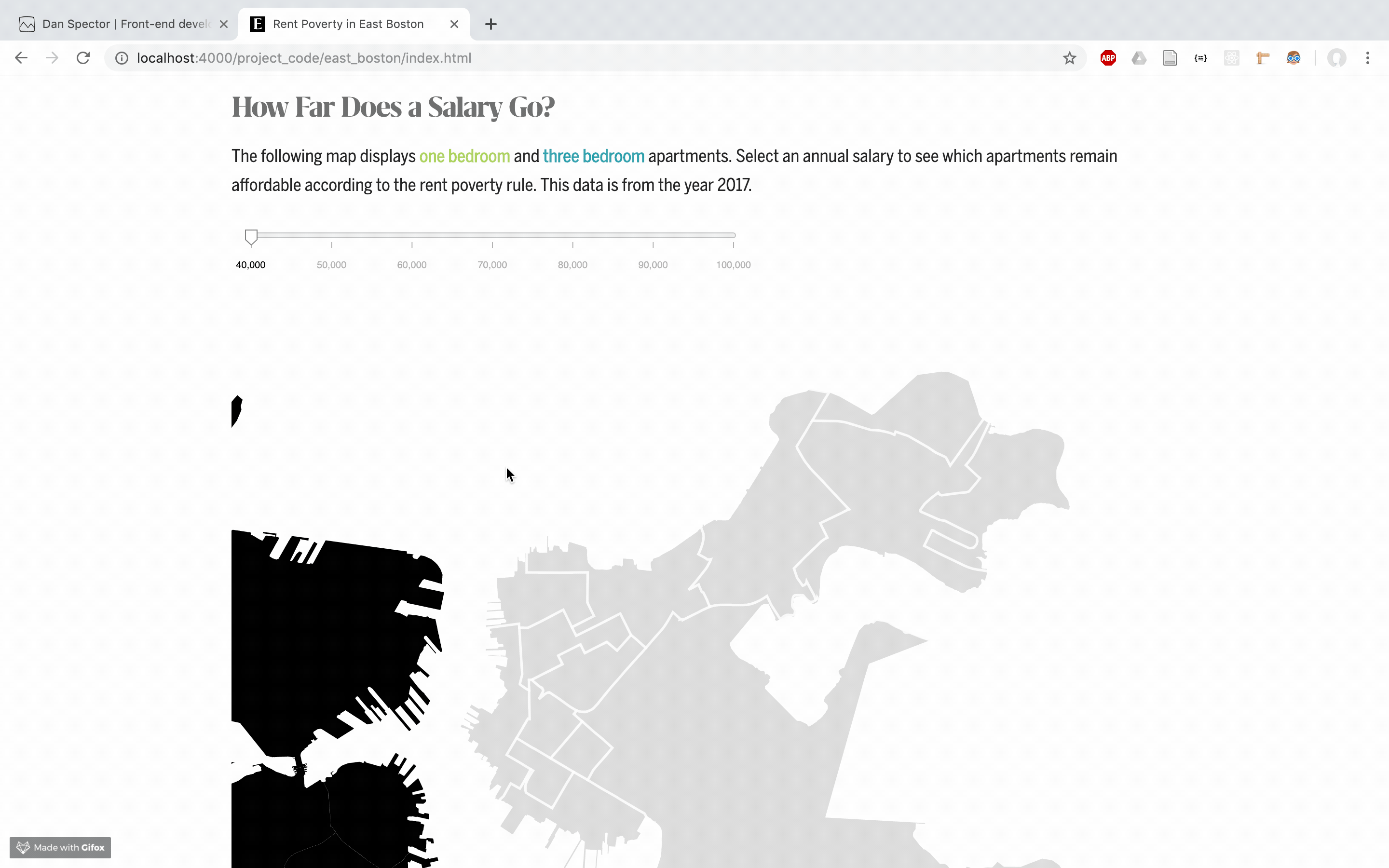
This is an example of a project that presents a simple graphic. The simplicity belies that fact that is there is a lot of complicated code and data manipulation going on to produce the end result!
The data filtering was actually quite difficult. Since the data was only grouped by latitude and longitude, and not neighborhood, I had to ask the GIS specialist from NEU libraries to isolate just the data that fell within the latitude and longitude of East Boston. (This was before I had any idea how to use GIS software!)
The line chart is rendered entirely in D3, and is powered by a dataset of all the Boston listings on Padmapper from the past five years. To generate the chart, I first filtered by the properties into 1, 2, and 3 bedroom units, and then calculated the average prices by year. All of this data manipulation was done in JavaScript. Then, I was able to use D3 to generate the lines.
This is how I calculate the average rent prices for each of the years:
 var averages = {};

      //this looped 9 times, once for each bedroom number. (The dataset had 0 - 8 bedroom apartments)
      for (var no = 0; no <= 8; no++) {
      //this array holds all the years and their corresponding averages by number of bedroom
      var averages_by_bedroom = [];

        //filtering by number of bedrooms. Each loop corresponds to a bedroom number.
        var subset = rents.filter(function(d){
          return d.no_bedrooms == no;
        });
            //a loop within a loop. Now I am filtering on year
           for (var year = 2013; year <= 2017; year++) {
              //Returns all the prices for each year, and then takes the average)
              var avg= d3.mean(subset, function(d){
                if (d.year == year) {
                  return +d.price;
                }
              });
              //mitigating for the undefined data
              if(avg !== undefined) {
                averages_by_bedroom.push({"year": year, "avg": avg});
              }
          }
          //the year average pairs are nested by number of bedrooms
          averages[no] = averages_by_bedroom;
      }
How To Improve This Project
Right now, it is a bit difficult to visualize the discrepancy between the rent poverty line and the average rent prices. Maybe I could render a vertical dotted line for every year between each of the price averages, and calculate the difference between the rent poverty line and the cost of housing. For the map, it might be fun to implement a tooltip that would allow the user to hover over each property to view how much it costs.
Shoutout to Bahare Sanaie-Movahed and Steven Braun for their assistance.