Three Trips from Boston
This is a visualization of three trips from my apartment in Boston. The first trip is to the North Pole. (No, I haven’t been yet, unfortunately!) The second and third are to my hometown in Pennsylvania, and to Ryder Hall on Northeastern’s campus. I created this project in Illustrator as a requirement for my introductory static visualization course.

We were supposed to present ten different points of information per trip. I decided to encode the stops in red, and my activities in purple. The green rectangles represent a horizontal scale visualizing how long it took to travel between each stop.
I immediately ran into a problem: two of my stops involved durations that were too large compared to all my other values! I struggled to represent these outliers without ruining the rest of my graphic! In the end, I decided to color these bars a lighter green, and included dotted lines indicating the day of my trip. I’m not sure if this was a satisfactory remedy, but I hope it made it clear that this part of the trip was exceptionally long.
Thank you to Professor Doug Scott and the rest of my class for providing such helpful critiques.
This is my first sketch of the project:
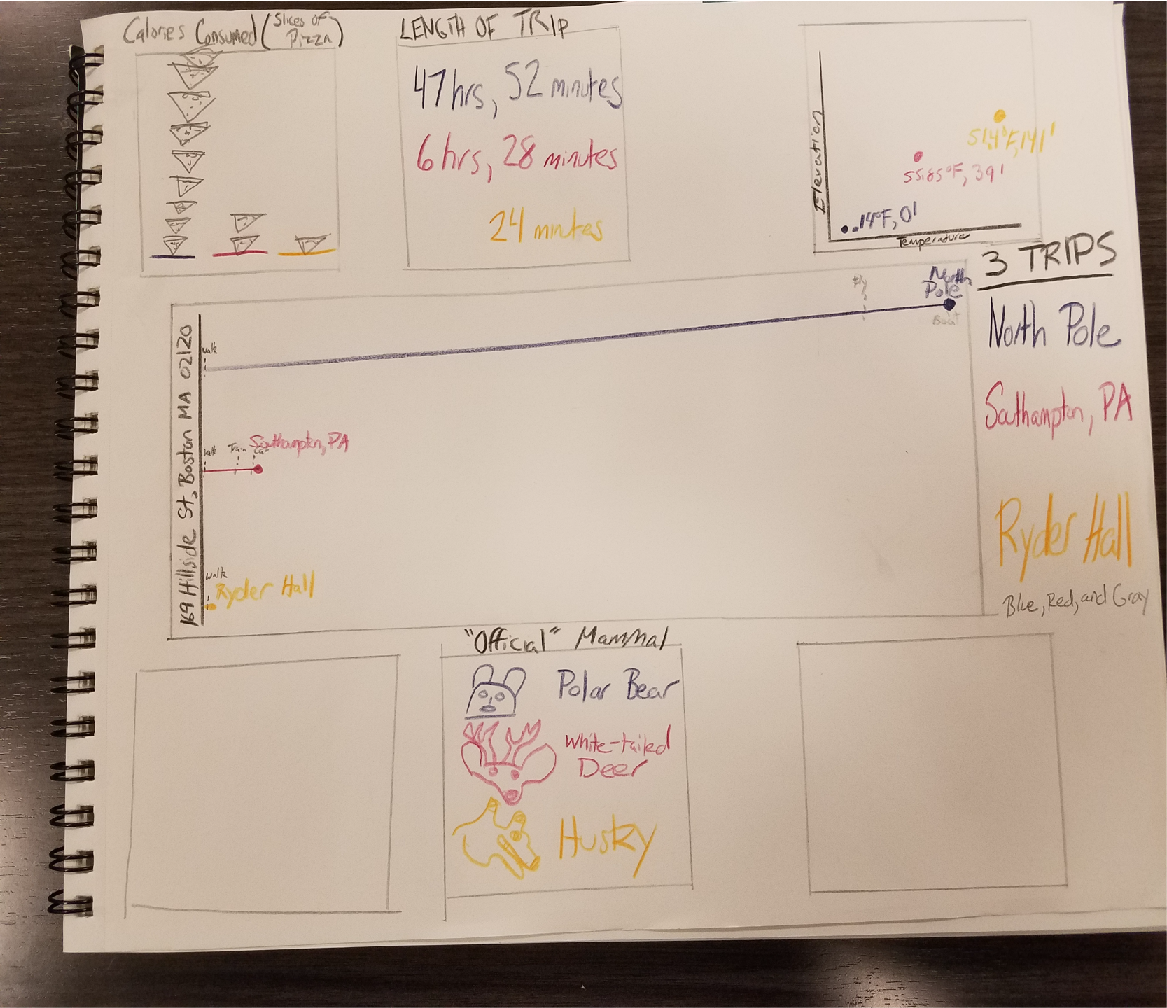
It is a bit different from the final product! I was baffled on how to incorporate all this data in one design, so I decided to go with several different boxes. I met with my teacher in office hours who gave me great advice to expand my middle graphic and make it vertical. This allowed me to take advantage of visual hierarchy and combine everything together.
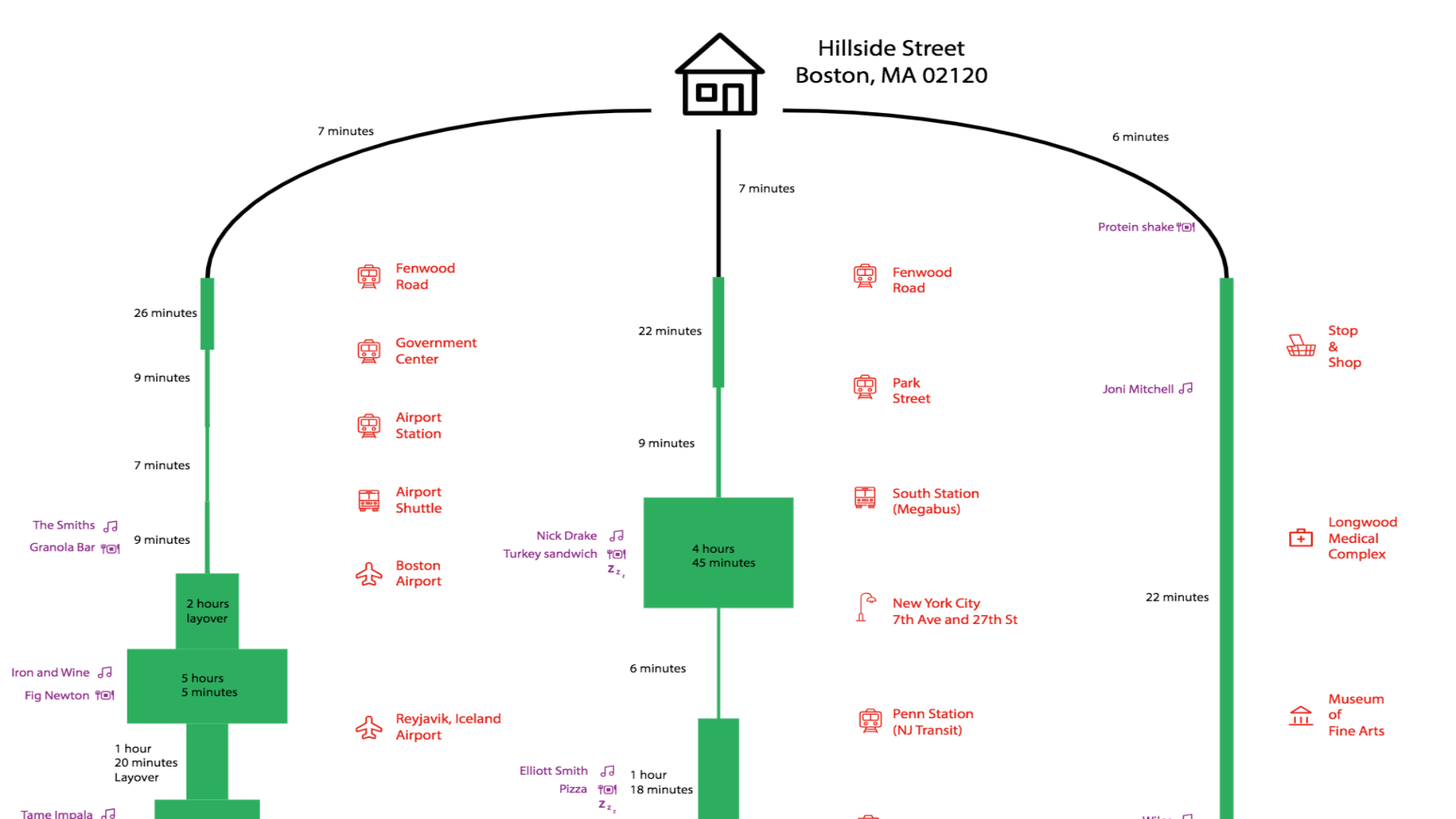
This following is one of many iterations I printed and taped together for critique. (Spoiler: after ten more tries and another trip to office hours, I finally learned how cut marks work!)
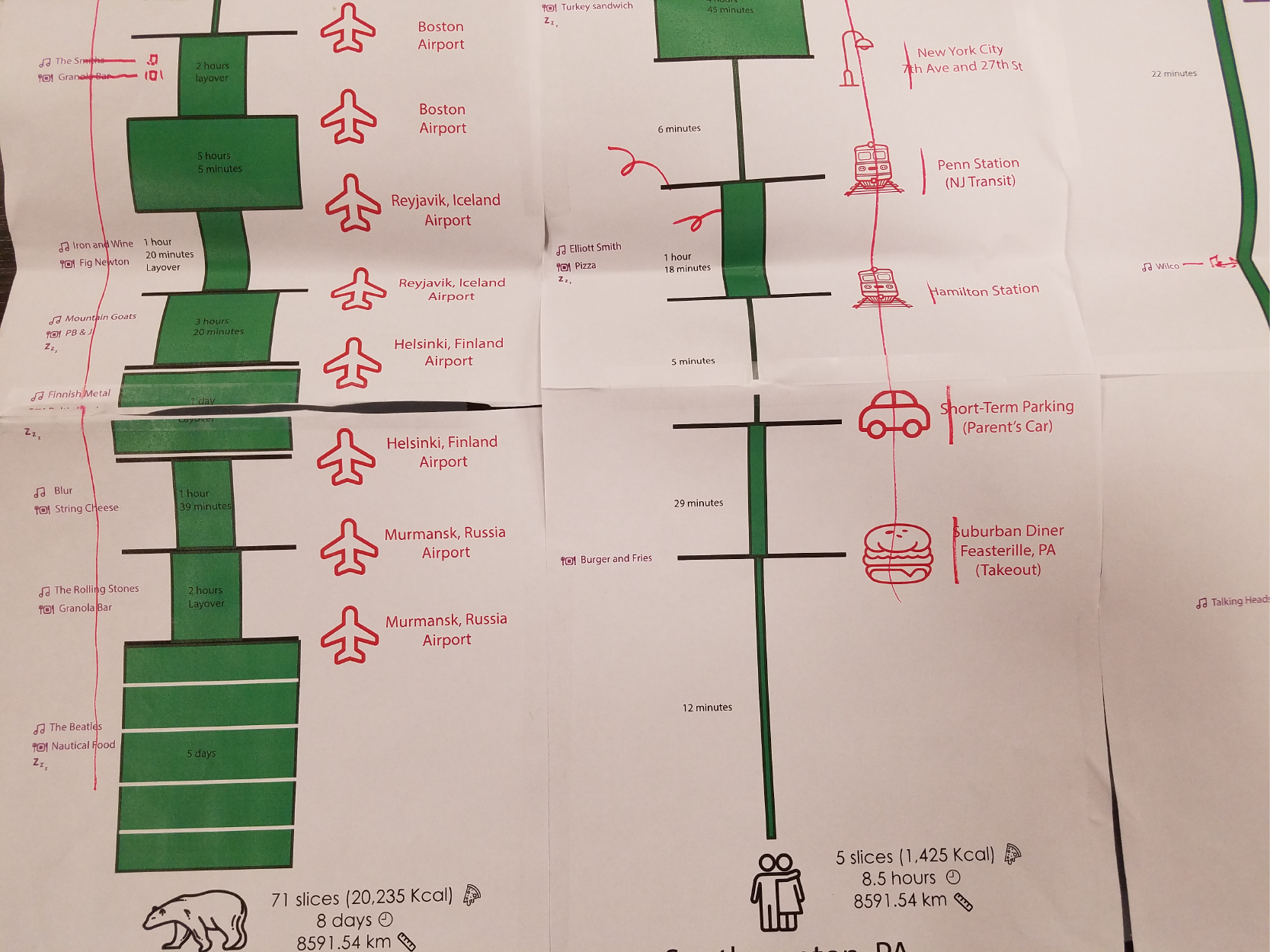
You can see that the icons are very large and most of the labels are not aligned in a logical way. Much of my time spent on this project was learning how to arrange objects in a pleasing graphical hierarchy. In addition, I was using stacked green boxes to represent travel longer than my maximum horizontal scale, which I eventually scrapped for my current design.